Are modern movies using flatter lighting than in the past?
I crunched the data on over a million shots of faces across 3,655 movies to see whether modern lighting is getting flatter.
Last week, I shared my analysis of how filmmakers are subtly changing how they frame human faces over time.
Today I wanted to take it one stage further and see if we can use those faces to measure how trends in lighting styles have evolved.
I’ve heard many people argue that modern films look “flat”, “grey” and “muddy”. In Patrick Willems’ video essay entitled “Why don’t movies look like *movies* anymore?” he argues that modern filmmakers avoid bold lighting, relying instead on high-dynamic-range digital cameras, heavy VFX workflows, and a fear of clipping or contrast.
Using my database of 1,024,493 shots of human faces across 3,655 live-action, fiction feature films, I have tracked three key lighting metrics to contribute to this debate.
What can we track?
Lighting can feel hard to quantify because most of us judge it by eye rather than by numbers. To make this study workable, I focused on three signals that describe how light behaves on a face. They do not cover every creative choice but they do capture the broad qualities people often mean when they talk about an image looking bold, soft or flat.
The first measure is Contrast. This examines the gap between the brightest and darkest parts of the face. A face with very bright highlights and deep shadows will score high, whereas a face with tones that sit closer together will score low.
The second measure is the Key Fill Ratio. This compares the brighter side of the face with the darker side. If both sides are lit evenly, the ratio stays close to 1. If the leading light creates a clear divide between the two sides, the ratio rises.
The third measure is Shadow Hardness. This tracks how sharp the edges of the shadows are under the nose, chin and cheek. Hard shadows have crisp boundaries and often come from small, focused light sources. Soft shadows have a gradual transition and usually come from larger, diffused sources. This is often the feature people notice first when they say older films look sharper or more sculpted.
These three signals are related but not interchangeable. In the data, overall contrast, shadow softness, and the balance of light across a face often move independently, which allows films to look softer without being evenly lit.
Individually, these measures describe one aspect of lighting, and together they provide a practical way to compare how films have been lit over time.
How have contrast levels changed over time?
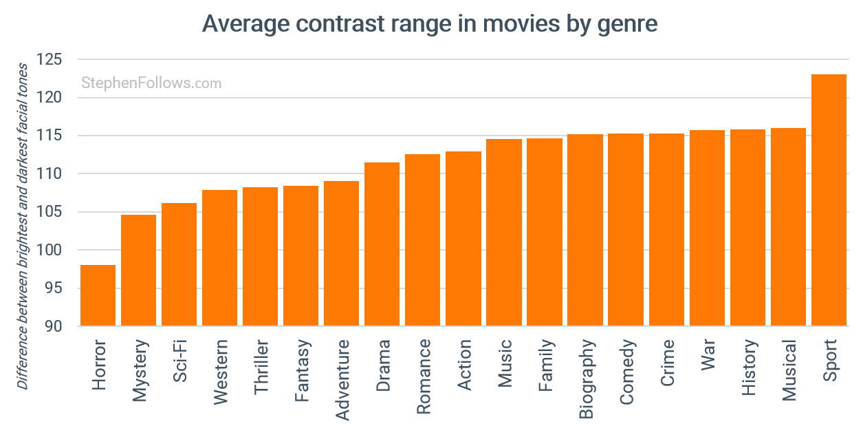
We’ll start with measuring contrast. This measures how far apart the face’s brightest and darkest parts are. Higher contrast creates a punchier look, whereas lower contrast brings the tones closer together.
What the industry refers to as “Genre Movies” tend to be at the lower end of the spectrum, such as horror, sci-fi and westerns. In these stories, truth and reality can be vague, so low-contrast levels serve the story/tone.
This is opposed to musicals and sports movies, which both rely on bold, attention-grabbing lighting and striking visuals.
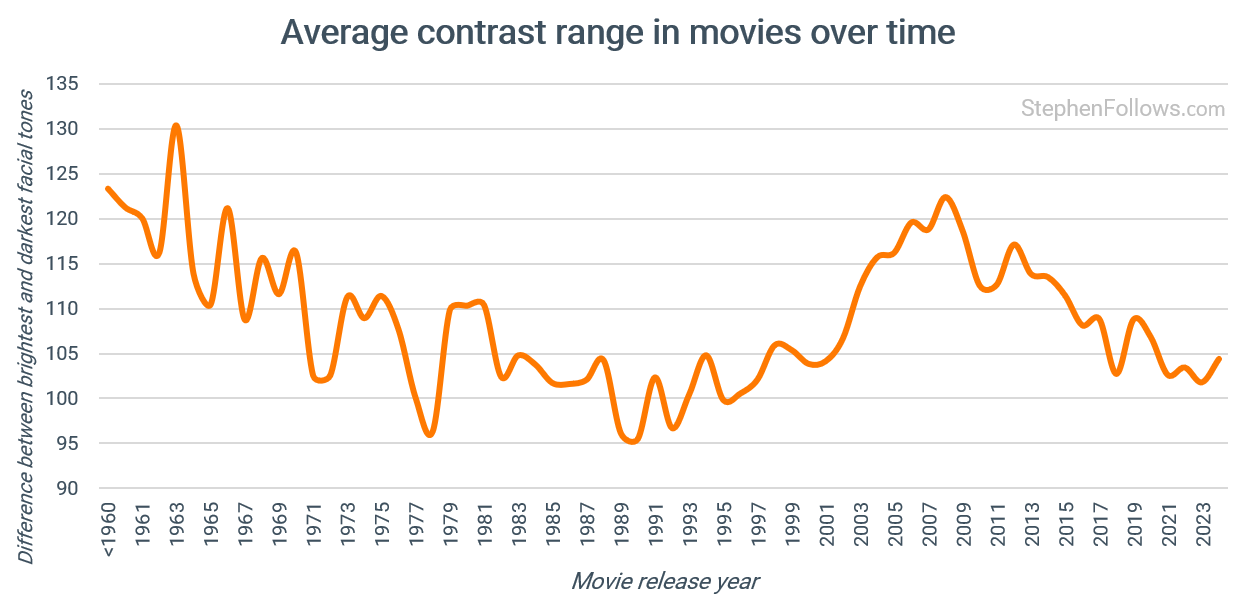
During the last century, we have seen consistently falling levels. Around 2000, levels started to rise again, peaking in 2008 at a level not seen since the 1960s. But since then, another decline has taken place.
So whether this supports the claim that modern movies have reduced their levels of contrast depends on what you mean by “modern”. We are not at the lowest point in the dataset, which was around 1990, but the past two decades show a clear, steady decline.
Have filmmakers changed how evenly they light faces?
Next, let’s turn to our second measure - the Key Fill Ratio, which compares the brighter side of the face with the darker side.
A rising ratio means the primary light source is becoming more pronounced. This gives us a sense of how strongly the light is shaped, even when the overall image may appear softer.
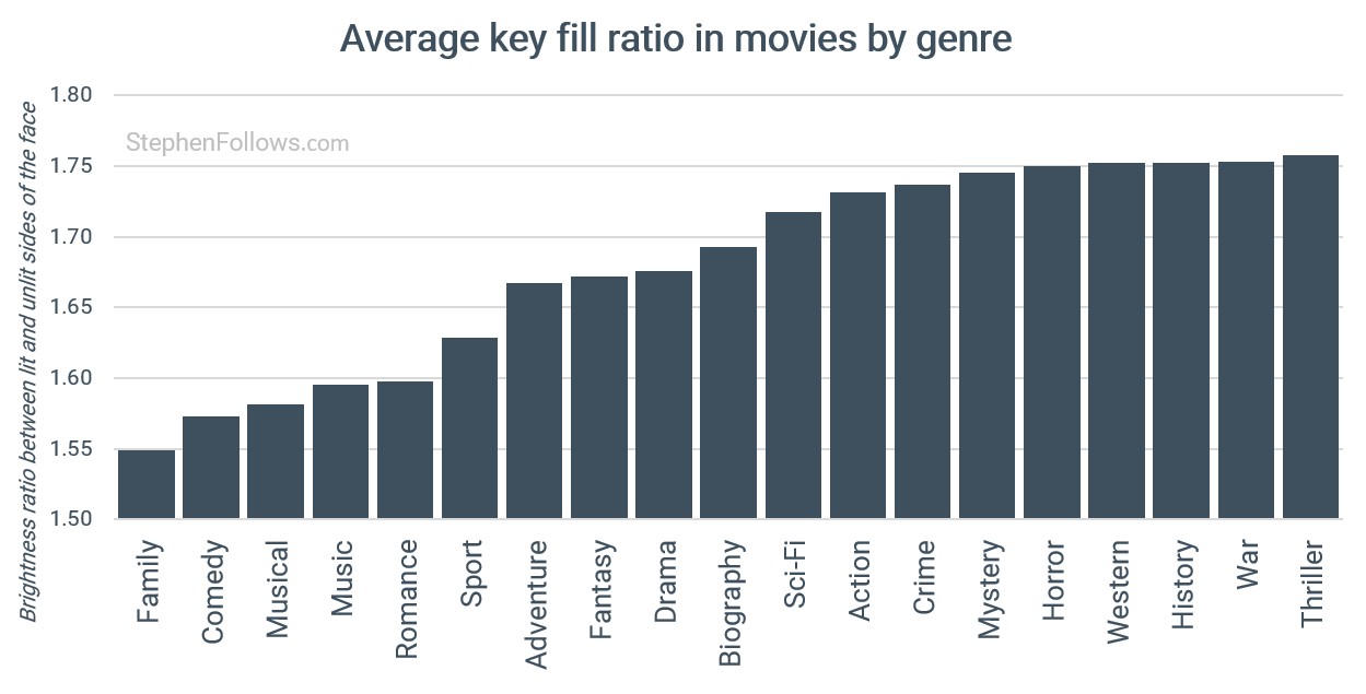
Family films, comedies and musicals favour bright, even lighting that keeps every part of the face clearly visible. As viewers, we want to see everything and feel comfortable.
Genres that want a stronger sense of tension or mystery tend to sit much higher. Crime, mystery, horror, westerns and war films all favour a more apparent divide between the bright and dark sides of the face.
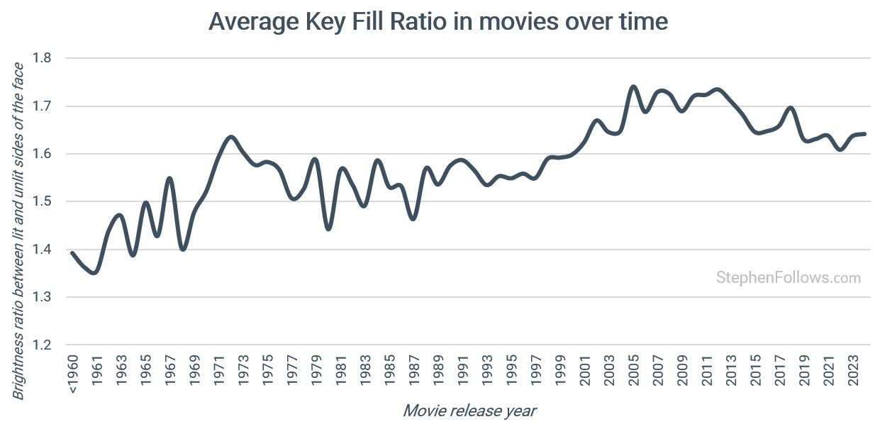
The Key Fill Ratio data reveal a gradual increase over time, with two peaks in the 1970s and 2000s. Again, we see a slight decline since around 2010.
Have shadows in movies become softer?
Finally, Shadow Hardness looks at how sharp or soft the edges of the shadows on the face are.
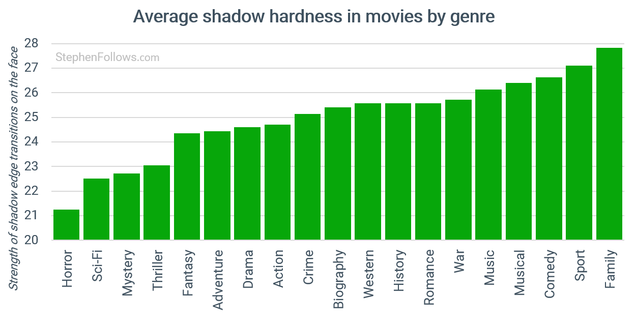
Genres show the same kind of spread we saw in the other measures. Horror and sci-fi sit at the softer end, reflecting their moodier, more atmospheric visuals. These films often use broad, diffused sources that keep shadows gentle and faces partially obscured.
As we move across the chart, the shadows become progressively harder. Westerns, history films and biographies introduce more defined shadow edges, particularly due to their use of practical light sources such as sunlight, lamps and windows.
At the far end, we find comedies, sports films and family films. These genres favour bright, lively images where everything on the face needs to be clear, and harder shadows keep the features crisp and readable.
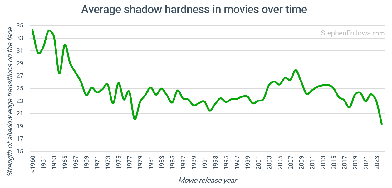
Shadow hardness has followed a long, steady decline. Early films show much sharper transitions, with clear edges under the nose, chin and cheek. This reflects the tools of the time. Smaller, more focused light sources were common, and filmmakers often relied on harder beams to carve definition into the image.
From the 1960s onward the edges begin to soften. Larger fixtures, diffusion materials and later LED panels make it easier to create broad, even light that wraps gently around the face.
There is a sharp drop in the mid twentieth century, followed by a long period of relative stability, and then a further softening over the past decade. This supports the idea that modern films favour smoother shaping and place less emphasis on crisp shadow lines than earlier eras.
So what have we learned about modern movie lighting?
Bringing these three measures together gives us a clearer view of what has changed and what has stayed the same.
Modern movies do show measurable signs of becoming flatter, but only in certain respects. Contrast has fallen, and shadows have softened, both of which move images toward a smoother, less sculpted look.
At the same time, filmmakers are still shaping faces with directional light, as shown by the long rise in Key Fill Ratio.
These shifts reflect both changing creative preferences and the tools filmmakers work with, from photochemical prints to digital cameras, HDR grading and modern exhibition formats.
So the data suggest that movies are not being lit more evenly, but more gently, which helps explain why today’s images can feel flatter without being truly flat.
Pedants’ Corner: What is a “modern” movie, anyway?
On this topic, the timeframe we’re talking about matters. Everyone may have their own period in mind when they refer to “modern movies”.
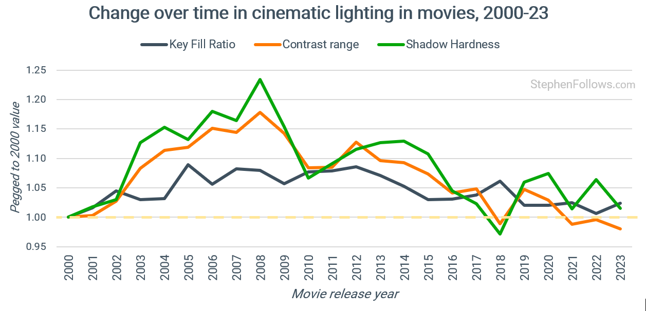
If we mean films this century, then we see a rise followed by a gradual softening over the past quarter century, with contrast and shadow hardness declining from their highs in the late 2000s.
The chart below shows the relative change in all three measures from 2000, with the yellow dotted line to help visualise the patterns.
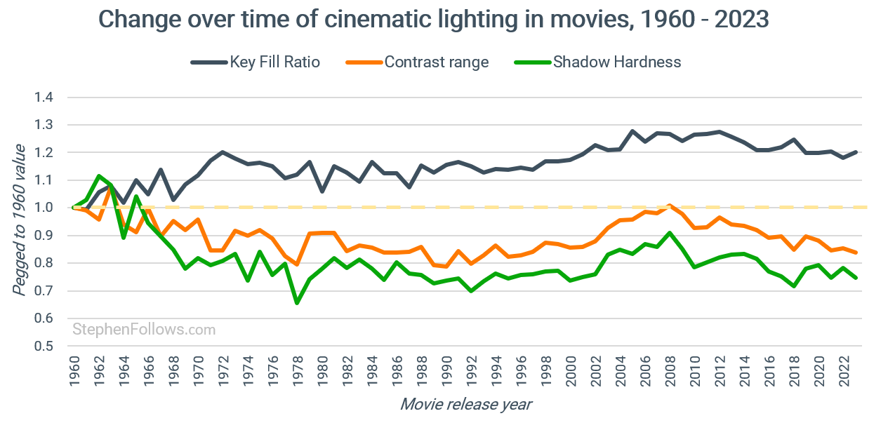
If we instead take a longer view and compare today’s films with those made in the 1960s, the direction of travel becomes much more pronounced: contrast is markedly lower and shadows are far softer than they were in earlier decades.
This means that whether modern movies “look flatter” is a question of perspective. Both trends are evident in the data, and the effect’s strength depends on the timeframe you consider.
Thoughts from the colour pros
I reached out to a few people who live and breathe this topic everyday. I’m very grateful for those who spent time to engage with the findings and what they may mean. Some asked to stay ‘on background’ but some were happy to be quoted.
One such person is John Daro, Lead Colorist at Warner Bros. He said:
From where I sit in the grading theater at Water Tower Color, the data you’ve visualized feels like the result of two underlying forces conflating: the evolution of technology and the natural ebb and flow of taste.
1. The Technological Shift First, we have to look at the transition from photochemical print to digital projection and HDR files.
Historically, film negative captured about 12 stops of dynamic range, but the print could only display 8 stops. This response is inherently non-linear at the extremes (shadows and highlights) and linear in the middle (midtones). Instead of hitting a digital “wall” where black is 0, the shadows gently compress. You get a soft, organic fade into the black floor. This gives film that “thick” shadow detail where things are dark but still have texture. The print compresses the brightest highlights rather than chopping them off. A window blown out on film retains a creamy texture because the transition to pure white is gradual.
With the advent of modern HDR cameras (like the Alexa), we are capturing 15+ stops of dynamic range, and we now have EDR projection and HDR home displays capable of showing it. We no longer have to compress the shadows and highlights to make the image fit the medium(although we do all the time for that “filmic” look.).
2. The Pendulum of Taste and Trends The second force is simply fashion. As your data shows, we hit a peak of high contrast around 2008. If you look at films leading up to that era like Domino, Speed Racer, Sin City, or 300—the look was aggressive and hi-con.
Then, right around the time the ARRI Alexa became ubiquitous, we saw a distinct “flattening.” My theory is that this originated in video village on set. Somebody saw the un-LUT’ed, Log signal from the camera on the monitors, which is inherently flat and desaturated to preserve data and thought, “Perfect! That’s exactly what I’m going for.”
The Bottom Line Ultimately, the pendulum swings both ways. Just because we have the extra dynamic range doesn’t mean we are obligated to use it. Every story sets its own visual rules, and as long as you stay within those project imposed boundaries for your narrative, there are no “bad” grades.
Someone else who was really helpful in talking through the methodology and results was colorist Cullen Kelly. He said:
There’s so much interesting discussion to be had around these results and observations. One big thing that comes to mind for me is the dramatic transformation of imaging pipelines over the last 25 years.
Until the late 90s, movies were shot and printed on film, and all three factors being measured (contrast, key/fill ratio, and shadow hardness) were defined almost solely in-camera, with only minimal changes possible in post-production (other than via speciality lab processes).
Since the rise of digital intermediate (DI) and digital cinematography, it’s a different story. Filmmakers today have full control over the imaging pipeline (how the movie is “printed”), as well as the color grade itself (how individual shots are shaped within that pipeline). That means the same image can produce totally different contrast, key-fill ratio, and shadow hardness measurements, depending on how it’s handled in post.
So, my take from a colorist’s perspective would be that we’re not just seeing a change in visual trend as the data show — we’re seeing more visual trends than ever before, because there are more variables in the system. I think this is one of the reasons why it’s so hard to meaningfully discuss and find consensus on the answer to the core question of whether movies are using flatter lighting than in the past.
Notes
Today’s research draws on 1,024,493 cropped, frontal faces taken from 3,655 live-action fiction feature films. I used PySceneDetect to identify shots, and MediaPipe Face Mesh to detect faces and rotate them to be level.
Faces were included only if they occupied at least 18% of the frame height. This helps to avoid wide shots in which facial lighting is too small or inconsistent to measure. If you want to read more about the size of faces in movies then you may enjoy Why are modern films framing actors’ faces differently than they used to?
Each final face crop was analysed for three metrics.
Contrast was measured as the difference between the 95th and 5th percentile brightness levels within the facial region.
The Key Fill Ratio was calculated by comparing the mean brightness of the left and right halves of the face.
Shadow Hardness was computed using the strength of edge gradients across the face, focusing on areas most likely to contain transitional shadows, such as under the nose, jaw and cheek.
The dates provided are the film’s initial release year. Genre categories are the primary genres on IMDb for each film.
Some charts don’t start their vertical axis at zero, which means the trends are visually magnified. I’ve done this to make the patterns easier to see, but it does mean readers should check the scale when thinking about how significant the changes really are. What I wanted to reflect here was the relative change, rather than any absolute measure.
All images were converted to the same colour space before analysis. I haven’t tried to compensate for colour grading, digital intermediates, or print stocks, as the purpose of the project is to capture the final on-screen appearance rather than to reverse-engineer original lighting setups.
Because the films span many decades, formats and pipelines, I haven’t reverse-engineered the original lighting ratios or colour transforms. The goal is to track broad stylistic changes in the delivered image, not to calculate photometric lighting values. For this reason, values such as key/fill ratio describe relative brightness in the image rather than true on-set lighting ratios, and should be interpreted comparatively rather than absolutely.
Epilogue
I feel that a few disclaimers are in order…
Firstly, I am not a director, cinematographer, nor colourist. I have a functional knowledge of these topics, but it’s far from my specialisation. Therefore, if anything I‘ve said is wrong, please do let me know and I’ll correct it. I’m also keen to hear what experts make of these findings, as I’m sure they can unlock far more meaning than I can with the data alone.
Secondly, I’m not applying any value judgments. I can’t say if high or low values are inherently better, nor does it measure artistic intent. Digital tools, production methods and exhibition formats have changed significantly across the 20th and 21st centuries, and those changes inevitably influence the results.
Finally, the measures used here do not capture every aspect of lighting, such as colour, multiple light sources or background integration. Still, they provide a consistent way to track core facial lighting characteristics over more than a century of filmmaking.


The 2008 contrast peak wasn't just aesthetic - it coincided with widescreen HDTV adoption hitting critical mass (2007-2009). Films were being designed with extreme contrast specifically because they needed to transfer well onto consumer HD displays, which were often badly calibrated and viewed in bright living rooms. Bold lighting with clean edges survived that transition better than subtle gradations.
I worked on Discovery HD docs during that era, and the pipeline forced these choices. Early HD compositing was fragile - After Effects would clip or band easily if contrast wasn't managed carefully. You optimized for what would survive broadcast encoding and consumer displays, not purely cinematic intent.
Then streaming platforms scaled (2010s), and the optimization changed again. Content needed to work across laptop screens, phones, tablets - all with different brightness and viewing conditions. Images that avoid extreme local contrast compress more efficiently at acceptable bitrates. Encoders struggle most with high-frequency detail and sharp edges during motion; soft gradients and gently rolled-off contrast are cheaper to encode.
Your finding that modern films are "lit more gently, not more evenly" captures this perfectly. We're not eliminating directional light, we're compressing the range so it survives compression algorithms and works across inconsistent display environments.
If we're heading toward a content reset around Q2 2027, the question is: what display format are we optimizing for next? Theatrical is weakening, streaming is fragmenting, and micro-dramas on 6-inch portrait screens might be setting the next visual language.
Great data analysis as always! I’m not an expert either, but one thing that makes it hard to analyze completely is that for a long time (1970s?, maybe 80s -to at least the late 90s) features would have to make a low contrast print (or “Lo-con”) print that was used for telecine - for tv and home video use. This was a standard deliverable during this period, at least for indie films. Consequently, if anyone’s analyzing films from that time, you’re likely looking at those low-con print telecines rather than the theatrical or “answer print” versions. Many DPs and directors hated how these Lo-con prints looked and what they did to the original intent of the films. But the distributors required it in order to be “TV safe” for QCing. (Theory being that regular def TVs couldn’t handle the full contrast range.) I think it had a feedback affect, too, which led to DPs intentionally using less contrast in order to start with a TV-safe version (especially if it wasn’t exactly a theatrical release kind of movie). You probably see this issue in TV shows shot on film during that era, too (see LA LAW vs Hill Street Blues, for example, which was revolutionary for its gritty contrast for network drama.) It’s interesting that the contrast graph you have aligns with this period. Sadly, for many films that used Lo-con prints, those are the only versions that exist now. [my experience comes from when I was “post supervisor” on the film that would eventually be called AMERICAN KICKBOXER 2 summer of ‘92. But then making my own 35mm feature OMAHA (the movie) a couple years later. Notably for really low budget indies like that film (co-founding film of Slamdance) we couldn’t afford Lo-con prints - we just did “one-light telecine.