The handful of tropes used by most horror movie posters
How many times have you seen a new movie poster and thought 'That looks just like the poster for [another movie]"? I'm guessing... pretty often.
Movie poster designers don't seem worried about their work feeling derivative and often they are actually counting on your sense of déjà vu to promote their new movie. So it's not surprising that some movie posters end up looking similar to one another. Even with that in mind, I doubt most people are aware of just how little diversity there is within movies of the same genre. Today, I'm going to share the patterns among horror movie posters.
This research was part of an eighteen-month project I conducted studying all aspects of horror movies. The final result is a 200+ page report into all aspects of horror movies. You can learn more and grab your own copy, at stephenfollows.com/horrorreport
As part of that research, I looked at movie posters. A lot of movie posters. 5,761, to be precise. These represent all the posters I could find for horror movies released between 1996 and 2016, inclusive.
Common themes, patterns and imagery
The Horror Report goes into more detail on the topic of horror movie posters but here are a few interesting nuggets I found during my research:
Bigger budget films tend to have more confidence in abstract images, such as a silhouette, hand or an eye.
Lower budget films rely more on showing specific plot elements, such as the villain, protagonist, or a line-up of actors.
The majority of horror movie posters feature one or two human (or human-like) figures.
Recurring themes in horror movie posters include eyes, skulls and hands.
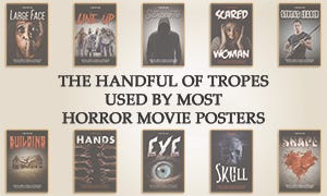
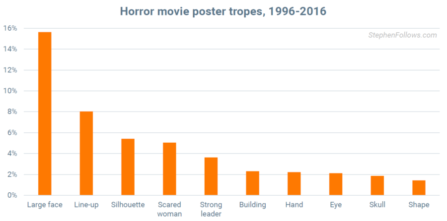
I grouped the most common layouts into ten tropes. The most commonly used trope is what I call 'Large Face', where the poster is overwhelmingly made up of - yes, one large face. Other popular tropes include 'Line-up' (featuring a number of characters standing side-by-side), 'Silhouette' (where a lead character is visible mainly in silhouette) and 'Scared Woman' (featuring... well... a woman who is scared).
Below, you'll find examples of the most commonly used horror movie poster tropes, along with some interesting findings on each.
Horror movie poster trope 1: Large face
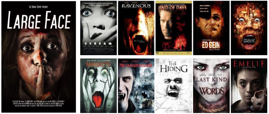
The most commonly used trope is a single large face, with 53% of films using some variant of this. Of these, over 68% of posters had the featured character looking directly at the viewer.
Posters using this trope are typically aiming to evoke fear or unease in the viewer. Posters with large faces looking directly at the viewer draw the prospective audience in by placing them in direct interaction with the protagonist, whether victim or villain.
The large face trope is notably underused in the horror comedies, perhaps due to the lack of comic potential, with the exception of the ‘meta’ horror-comedy-whodunnit Scream (1996) and slapstick horror comedy Braindead (1992), directed by Peter Jackson.
In the vast majority of cases, large faces belong to human adults; in only a small number of instances, the poster reveals a non-human villain in full to the viewer. Victims and villains are far more likely than heroes. This is a direct departure from most films, which highlight the hero. Eye colour is often used to provide a clue as to whether the owner of the face is a villain or victim, with black or red eyes often indicating the face’s malevolent intent, blue indicating a victim and green the supernatural.
Sub-trope: Disfigured Face: Just over half of the ‘Large Face’ posters also fit into a sub-trope I’ve called ‘Disfigured Face’. These posters feature a large face which has been attacked, altered or physically affected in some way. Disfigured faces are a popular trope in horror film posters, often used in body horrors such as Contracted, Possession (The Devil Inside) and movies heavily featuring torture. The disfigured face can indicate either a villain or a victim and usually indicates someone who is ‘othered’ and best avoided. Disfigurement is often of the eyes or mouth, with the eyes darkened and the mouth closed.
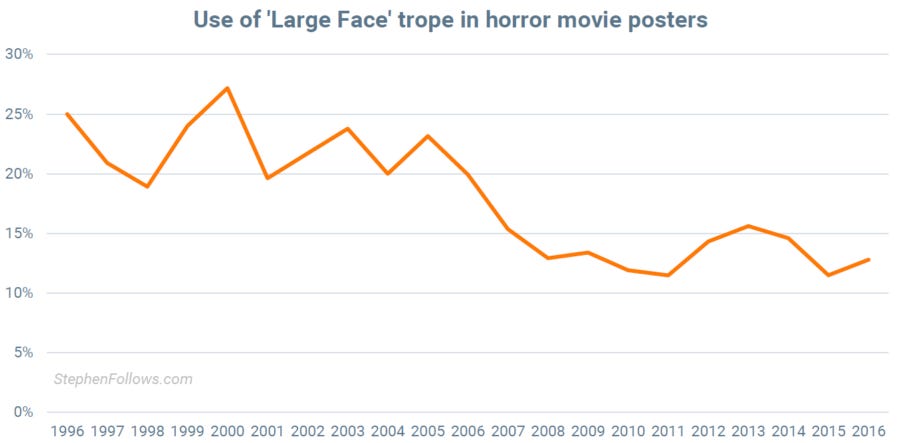
Despite it being the number one trope, its use is waning over time.
Horror movie poster trope 2: Line-up
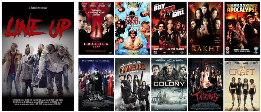
The ‘Line-up’ trope features a number of the characters looking directing at the camera, often arranged to signify their significance to the plot and their relationship with each other.
The ‘Line up’ film poster is commonly used across genres to sell a film based primarily on the box office power of its cast. It can also be used to imply that much of the movie will rely on the interactions between the characters, rather than actions with an unseen or ‘other’ being. As a result, this trope is used three times as often for horror comedies as for horror thrillers.
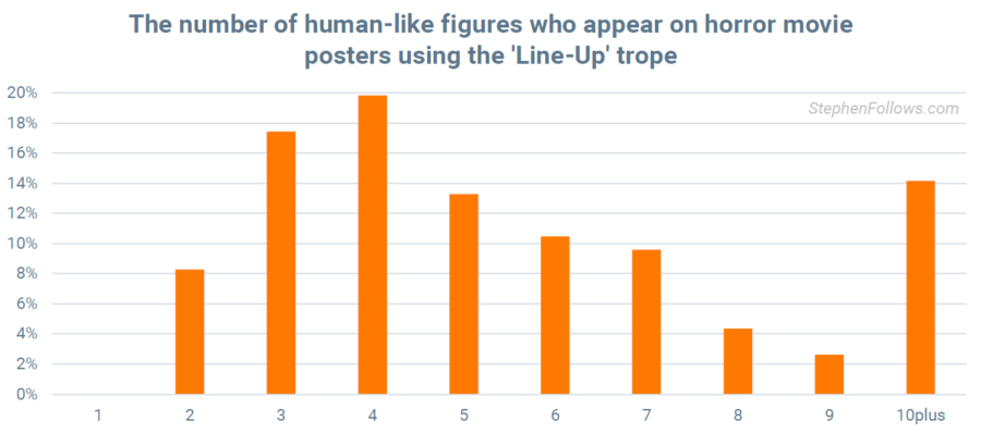
The most common number of identifiable figures in this trope is four.
Horror movie poster trope 3: Silhouette
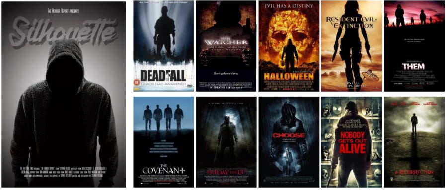
5% of horror movie posters fit into the ‘Silhouette’ trope. These suggest either an uncertain threat at the heart of the film or a hero shot of the protagonist(s).
Silhouette posters were disproportionately used within 'found footage' horror movies.
Horror movie poster trope 4: Scared Woman
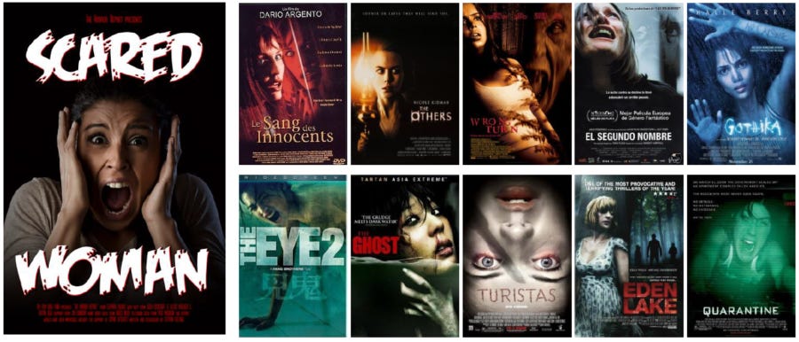
Psychological thrillers most commonly use the clearest victim trope, that of a scared woman. The woman is typically looking off-screen towards an unknown threat. The trope is rarely used among horror action movies and horror comedies but is extremely popular for psychological thrillers and killer movies.
Horror movie poster trope 5: Strong Leader

Given their propensity for single heroes fighting a greater threat, it’s perhaps unsurprising that action-horror films most commonly focus on their heroes. The trope of strong leaders on posters gives a clear idea of the content of the film itself.
Horror movie poster trope 6: Building
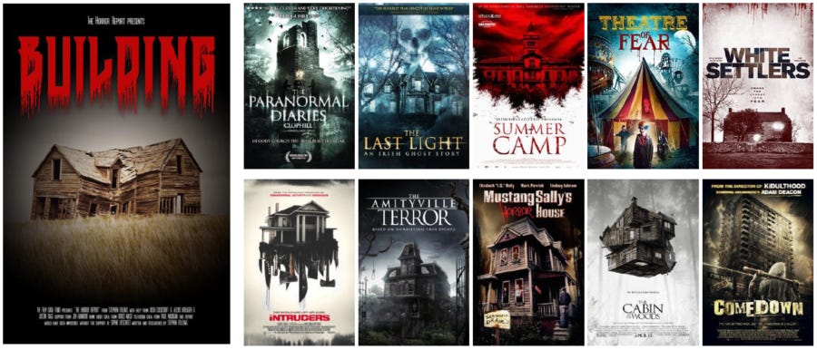
Single location horror, usually linked to paranormal horror, tends to feature its location on the poster itself. This gives a notion of the type of film and hints at the threat behind it, without giving too much away.
Horror movie poster trope 7: Hand
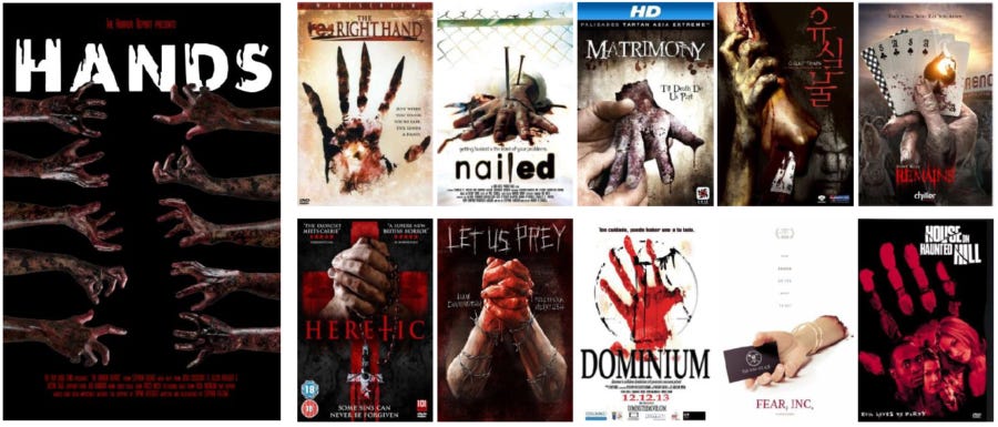
Hands are a common trope of horror movie posters, either to represent a threat (such as gripping, pulling or surrounding people) or to represent a victim (reaching for help or escape). The use of hands makes it easier for the audience to project themselves into the film because the poster hasn't presented a specific protagonist.
Sub-trope: Hand from the Ground: Hand from the Ground is now such a strong associative idea that it not only provides a clear shorthand for evil rising from the dead but also offers opportunities for satire of the horror trope itself. Therefore, this sub-trope is more likely to be employed by a horror comedy or a horror romance than by a horror thriller.
Sub-trope: Hand Reaching: A hand reaching to the viewer, often through glass, is a common trope in horror - permitting ambiguity as to whether the hand belongs to the villain or the victim while giving a definite sense of threat. Unlike the other hand sub-trope, the Hand Reaching motif is rarely, if ever, light-heartedly used in a horror comedy or romance.
Horror movie poster trope 8: Eye
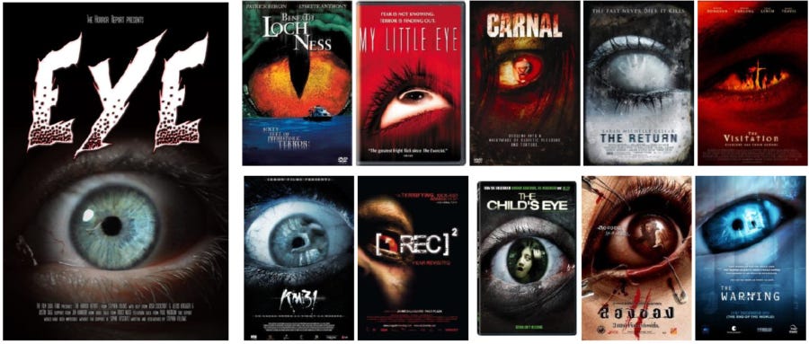
Eyes offer a shorthand for the perceived threat. Generally wide with fear, or even reflecting the film’s danger in the iris, they can offer a different way of signalling an unseen menace. Alternatively, they provide a powerful way to show an element of a monster or a sub-human threat. They are rarely used for comedy horror movies, most often featuring on posters for mysterious horror movies.
Sub-trope: Hidden eyes: Hidden eyes have different implied meanings depending on their context. While they can signify that a victim is taken by surprise, they can also signify an inhuman, non-human or evil element in a villain.
Horror movie poster trope 9: Skull
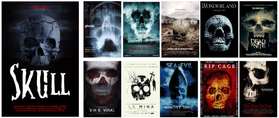
Human skulls have immediate and obvious connotations of death and allude to the past life of the owner of the skull. In horror, they also commonly denote the supernatural.
Horror movie poster trope 10: Shape
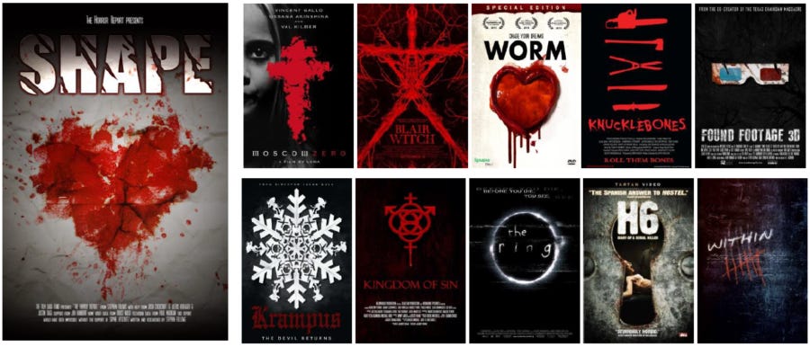
Some films use a wider range of symbols, generally religious imagery, weapons and torture tools, also cameras or other recording equipment. This trope is twice as likely to be employed to promote a horror action film than a comedy horror.
Combining tropes
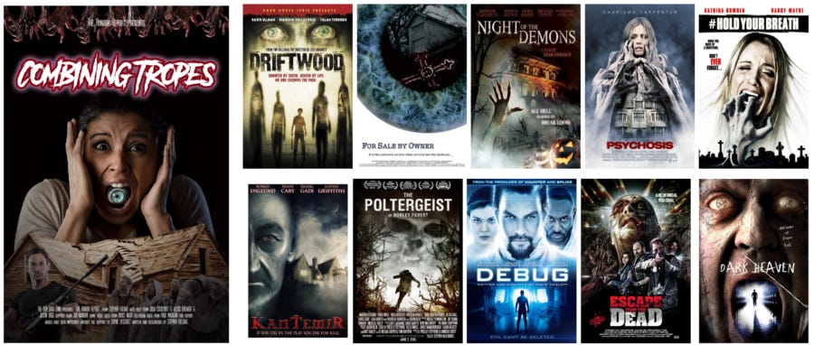
5% of horror movie posters combine multiple tropes. It’s debatable whether such combinations have a positive impact on the viewer (by giving them more clues and information about the movie) or a negative impact (confusing the clearly established tropes and their connotations).
Notes
For details of methodology and notes, please read the Appendix of the Horror Report.
As you may have noticed, I created example posters for the tropes. If you are an educator who would like high resolution copies of these mock-ups, just drop me a line.


