


I had the privilege of seeing Terminator 2 in the cinema a few weeks ago, in a 4K restoration released to celebrate its 35th anniversary. Beyond providing a terrifying context to the very real discussions of rampant AI in the news, it also made me think of the ‘Teal and Orange’ arguments of sixteen years ago.
The hospital corridors were teal. The shopping mall was teal. The desert was teal. Then the finale arrived, all molten steel and fire, and the whole thing felt like a film graded last year rather than in 1991. I made a note to check whether I was imagining it
In 2010, Todd Miro published a blog post titled ‘Teal and Orange: Hollywood, Please Stop the Madness’. He singled out Transformers: Revenge of the Fallen as the worst offender and pointed out what it does to actors' skin tones.

He ended his polemic with:
Please people, spread the word and fight. Fight against this horrible visual injustice. If nothing is done, we will never see our friends green, or purple, or even red again. Imagine a world without red people! It could be right around the corner.
AAAAAHHHHHHHH I can’t take it any more!
Seriously, I weep for cinema of this dark age. I think twenty years from now people will look at films of this era and say “My God - what were they smoking??!?”
I left Terminator 2 exhilarated by seeing a stunning piece of cinema, but also on a mission to discover the latest on the teal-and-orange phenomenon.
I studied the colour of 12 million frames across 8,135 feature films to discover if ‘teal and orange’ really was, as The Guardian labelled it, Hollywood’s new colour craze. And if so, has it passed?
What is the look, exactly?
Human skin, whatever its shade, sits in the orange part of the colour wheel. Pale skin is a light orange, dark skin is a deep one, and almost nobody’s face is green.
The colour opposite orange on the wheel is a blue-green, which colourists call teal. If you push a film’s shadows and backgrounds towards teal while leaving skin warm, every face in the film stands out from whatever is behind it, as if lit from within.

How do you measure it?
The data covers 12 million shots from colour live-action fiction feature films, one frame per shot. I averaged the scores per movie, weighted by how long each shot stays on screen. More info on my methodology is in the Notes at the end of the article.
I then ask the data two questions:
What share of the coloured pixels sits in the orange band of the colour wheel? This includes colours from red-orange through to amber, including skin, wood, lamplight, and sunsets.
What share sits in the teal band? This is the blue-green of modern shadows, dispatch rooms and hospital corridors.
I count a film as carrying the look when teal and orange each cover at least a tenth of its coloured picture.
Imagine pouring every coloured pixel from the whole film into one jar. If teal fills at least a tenth of the jar and orange fills at least a tenth, the film carries the look.
This lets us identify when the look is a dominant part of the aesthetic. A film with a single moody teal scene and ninety minutes of daylight would not score highly.
In practice, about nine films in ten clear the orange bar, since nearly every film has skin and/or lamplight in it, so what decides the test is whether the teal is there across the whole running time.
When did the movies go all ‘orange and teal’?
The start of the current century saw a revolution in film grading with the introduction of digital grading tools, allowing more control over colour than ever before. O Brother, Where Art Thou? (2000) was the first Hollywood feature to use the Digital Intermediate process from start to finish, in which the shot footage is scanned, graded shot by shot on a computer, and printed back to film.
By 2005, half of all Hollywood movies were completed this way, and by 2007, seven in ten were. It wasn’t long before consumers also got their hands on tools that could do this, and by the time DaVinci Resolve became a free product in 2011, everyone had the power to make things look orange and teal.
But did they?
Yes. Oh, yes they did.
Across my dataset, the levels of orange and teal in movies had been pretty much static for half a century. But as the digital tools started to creep in, and then take over, the teal floodgates were opened.
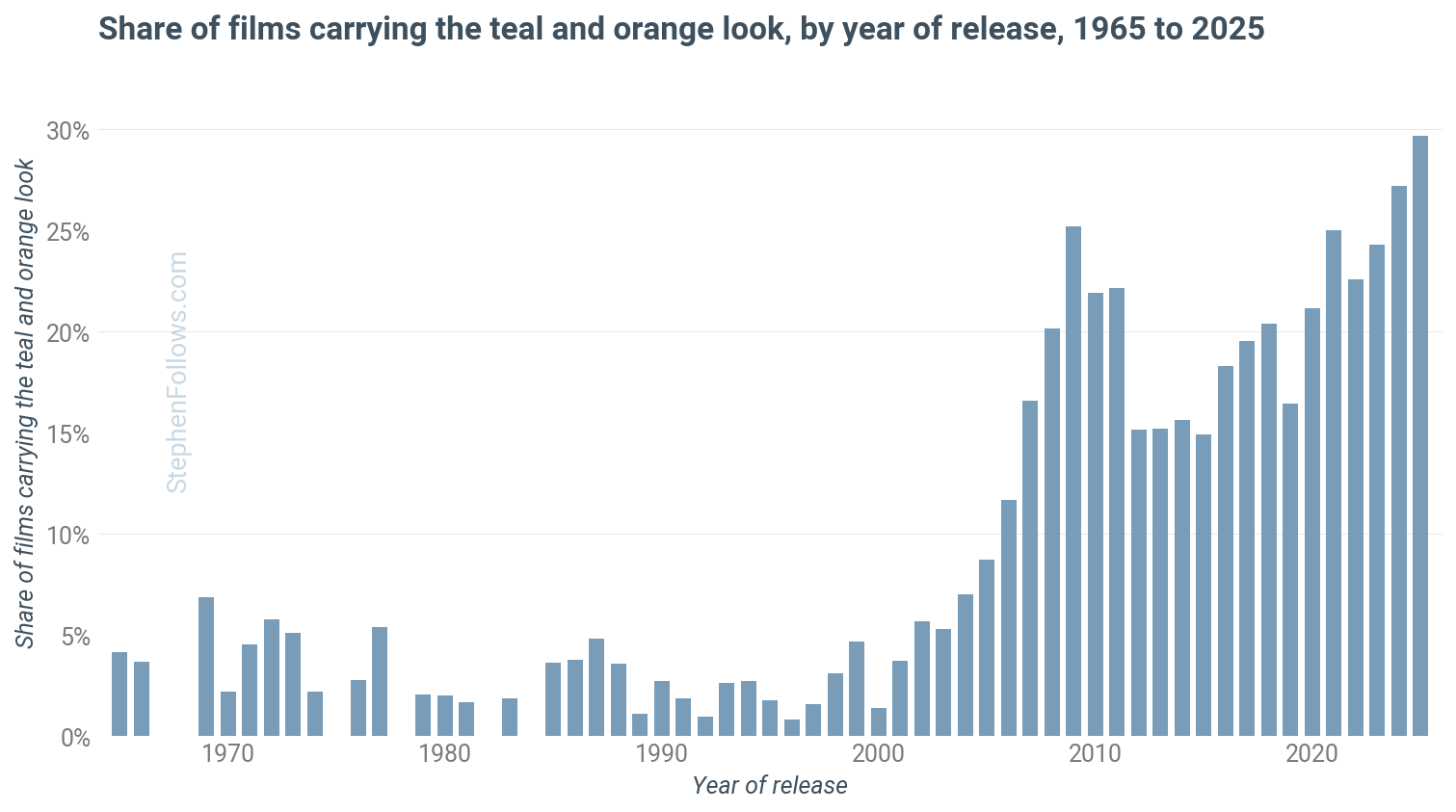
From 1965 to 2002, the share of films carrying the look never got above 7%, and mostly under 4%. Then it took off. It was 5% in 2003, 12% in 2006, 20% in 2008 and 25% in 2009.
In six years, the look went from something one film in twenty did to something one film in four did.
This is actually not about orange and teal taking over
So we have confirmed that the look existed and became common. But here’s the interesting thing - it’s not really about ‘orange and teal’.
In fact, the levels of orange in movies fell dramatically over the period in question.
Orange fell from 40% of the coloured frame in the 1990s to 24% in the 2020s. The orange was always there, in skin and tungsten light and wooden furniture, and the 1990s were in fact the warmest decade since the 1950s.
What changed is that the orange now sits against teal, and the frame as a whole got cooler.
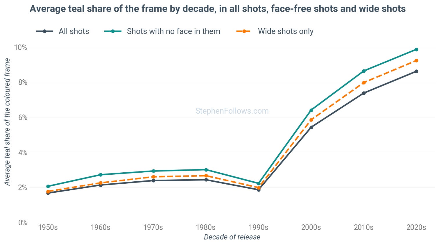
Teal made up 1.8% of the frame in the 1990s. It rose to 5.4% in the 2000s, 7.4% in the 2010s and 8.6% in the 2020s, more than four times where it started. In the 1990s, just 3% of films had teal covering more than a tenth of the picture, but in the 2020s it is 32%.
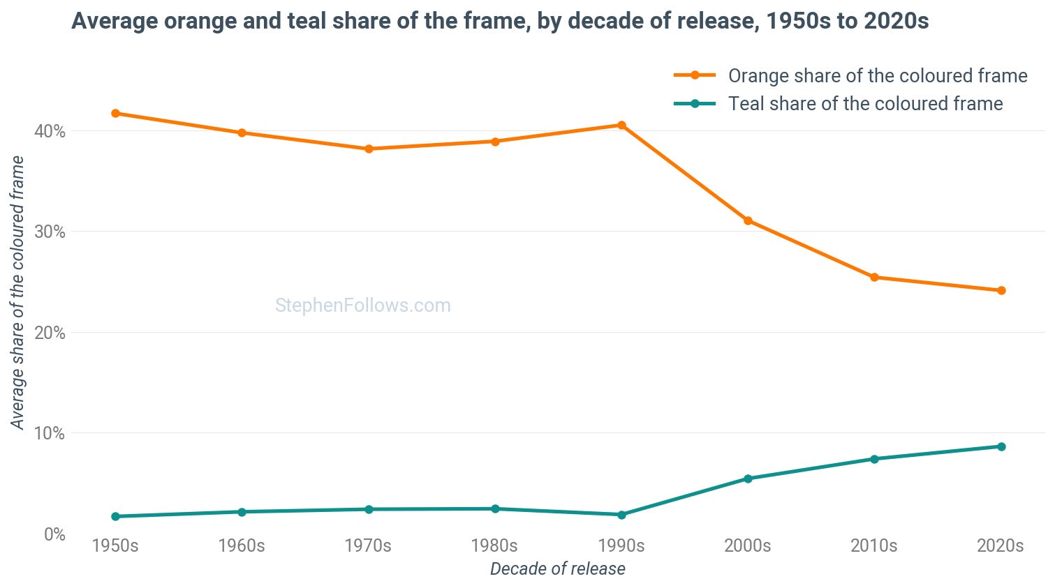
So rather than talking about the introduction of a new ‘Orange and Teal Look,’ we should instead be talking about a ‘Teal Takeover’.
So did it ever go away?
To see the rise and fall more clearly, I use a split score. This is a film’s orange share multiplied by its teal share. It is high only when a film has plenty of both, warm and cool in the same frame, and it tracks the look more finely than the simple in-or-out count above.
The split score peaked in 2009 and 2010, fell back through 2015, and then climbed again from 2016. By 2023 it was close to the first peak, and 2025 sits just below the 2009 high. The share of films carrying the look tells the same story in rounder numbers. It was 25% of films in 2009, 15% in 2015, and 30% in 2025, the highest ever measured.
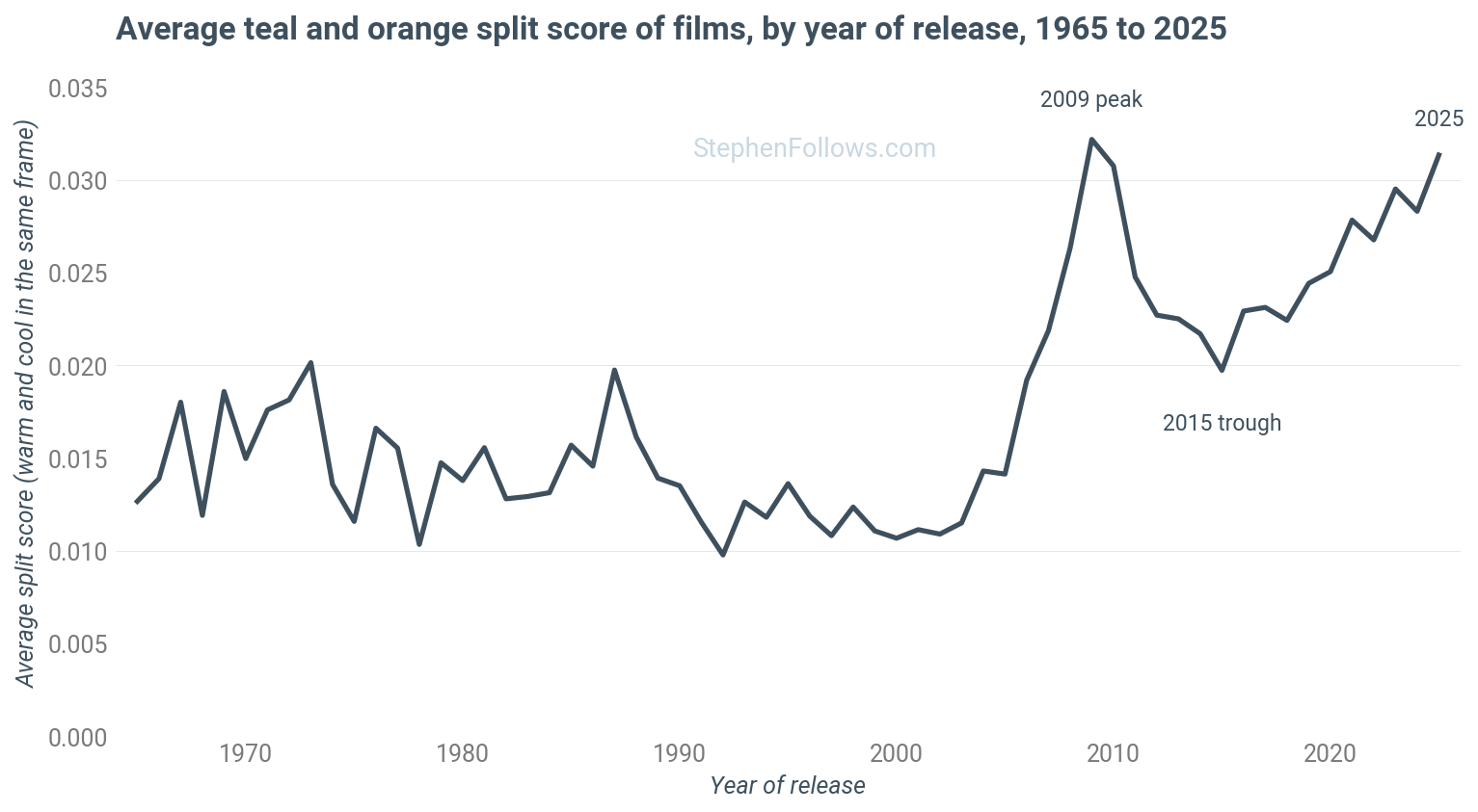
The retreat is real, and it is not the mix of genres changing. Action, comedy, thriller, drama and crime films each dipped between 2011 and 2016, and each has climbed back since.
And the timing of the retreat lines up with the backlash. Miro’s post went up in March 2010. The Guardian piece ran in August 2010. Wikipedia’s entry on colour grading dates the look’s arrival in the mainstream to that year, naming Hot Tub Time Machine and Iron Man 2, both of which score well above average on my measure.

The colourist Dan Moran wrote in Mixing Light in 2018:
The Teal and Orange look has been declining or should I say evolving over the last few years. I’m not sure what caused this. Overuse of LUTs in Vimeo/Youtube films? Mainstream news picking up on the trend?
For me, the pinnacle of the Teal and Orange era was the movie Battleship. It’s about as teal and orange as you can get!
My best guess is that as it’s such a well-known style of grade that filmmaker’s and studios are starting to ask for something less well known.
He was describing exactly the trough we see in the chart.
So the teal and orange is far from over. In fact, it is the most widespread it has ever been. We’ve all got used to it and stopped noticing.
Let’s have a look at the scores in a little more detail, to see whether the look is:
Tied to certain genres
Limited to bigger budgets
Mainly an American thing
And which filmmakers and creatives use it most.
1. Which genres lean into it?
While you might recognise it most from big blockbusters, the orange-and-teal look took over all but one genre after 2000.
The chart below shows the look's level by genre, split into films made before 2000 (grey dots) and those from 2000 onwards (orange dots).
Since 2000, the strongest split is in sport, action, comedy, thriller, sci-fi and crime films. Sci-fi has the most teal in the frame, at about a tenth of the coloured picture, followed by thrillers, action and horror.
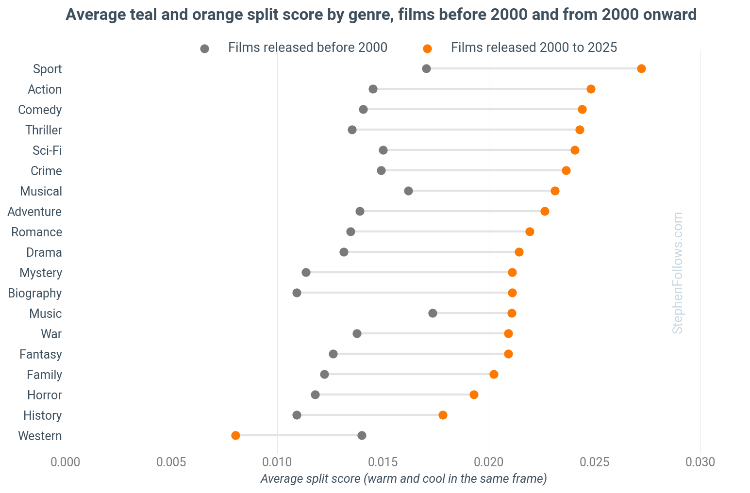
The one exception is the western, which went the other way. Westerns were about average before 2000 and are now the least split genre by a distance, having gone warmer and dustier as everything around them cooled down.
2. Is it a big-budget thing?
No. Films made for under $10 million average 6.1% teal, and films between $75 million and $150 million average 6.6%.
Only the very top tier, above $150 million, pulls away, at 8.2%.
A tentpole is more likely to be graded this way than a small film, but not by much, and a $5 million thriller is nearly as likely to be teal and orange as a $100 million one.
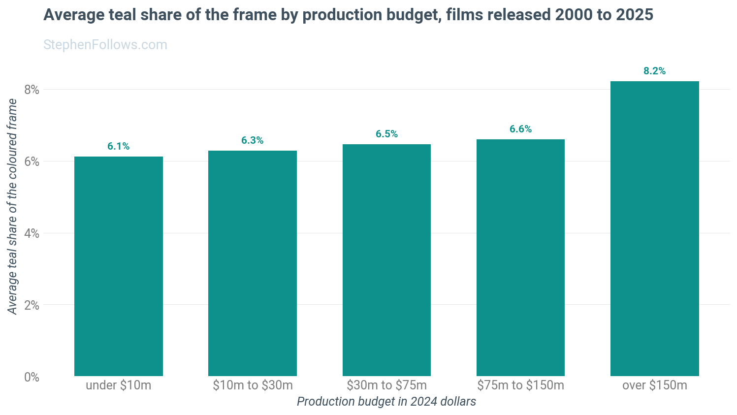
The look is not expensive, and it barely ever was. For only a handful of years, Hollywood alone had the tools to grade this way. After that, everyone had access.
3. Is it still a Hollywood thing?
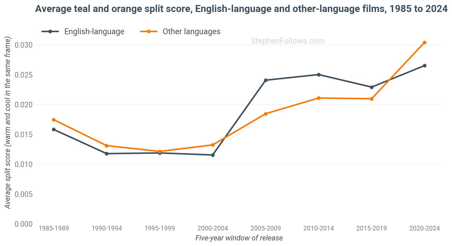
It’s true that Hollywood led the charge to orange and teal, but the rest of the world quickly followed suit.
Among countries with a reasonable number of films since 2010, the split score is highest for films from Germany, India, Spain, Italy and China, all of which score above the United States, while France and South Korea sit at the bottom of the table.
4. Who does it most?
Michael Bay is where you would expect him to be, with 14% of his frames teal and a split score twice the average for the years his films came out. But he shares the top of the table with Adam McKay, Pedro Almodóvar, Edgar Wright, Peter Berg and Alexandre Aja.
The directors with the most teal in the frame (rather than the strongest split) are Jaume Collet-Serra (18% of the coloured picture, across Non-Stop, Unknown and Jungle Cruise), Aja, Zack Snyder, Gore Verbinski and Bay.
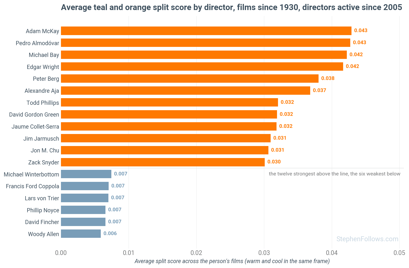
At the other end sit the warm holdouts. Woody Allen has 38 films in the dataset, and just 0.6% of his frames are teal. Quentin Tarantino is 41% orange and 2% teal. Wes Anderson and Scorsese are warm too.
Then there is a small group that's cool without being split. David Fincher has plenty of teal (10% of the frame) and far less orange than most (9% of the frame, against a typical 25%), so his films have one of the lowest split scores of any working director. Denis Villeneuve is similar, and Dune: Part One has the lowest split score of any well-known film of the 2020s, with a teal share which rounds to zero. Christopher Nolan, for what it is worth, is bang on average.
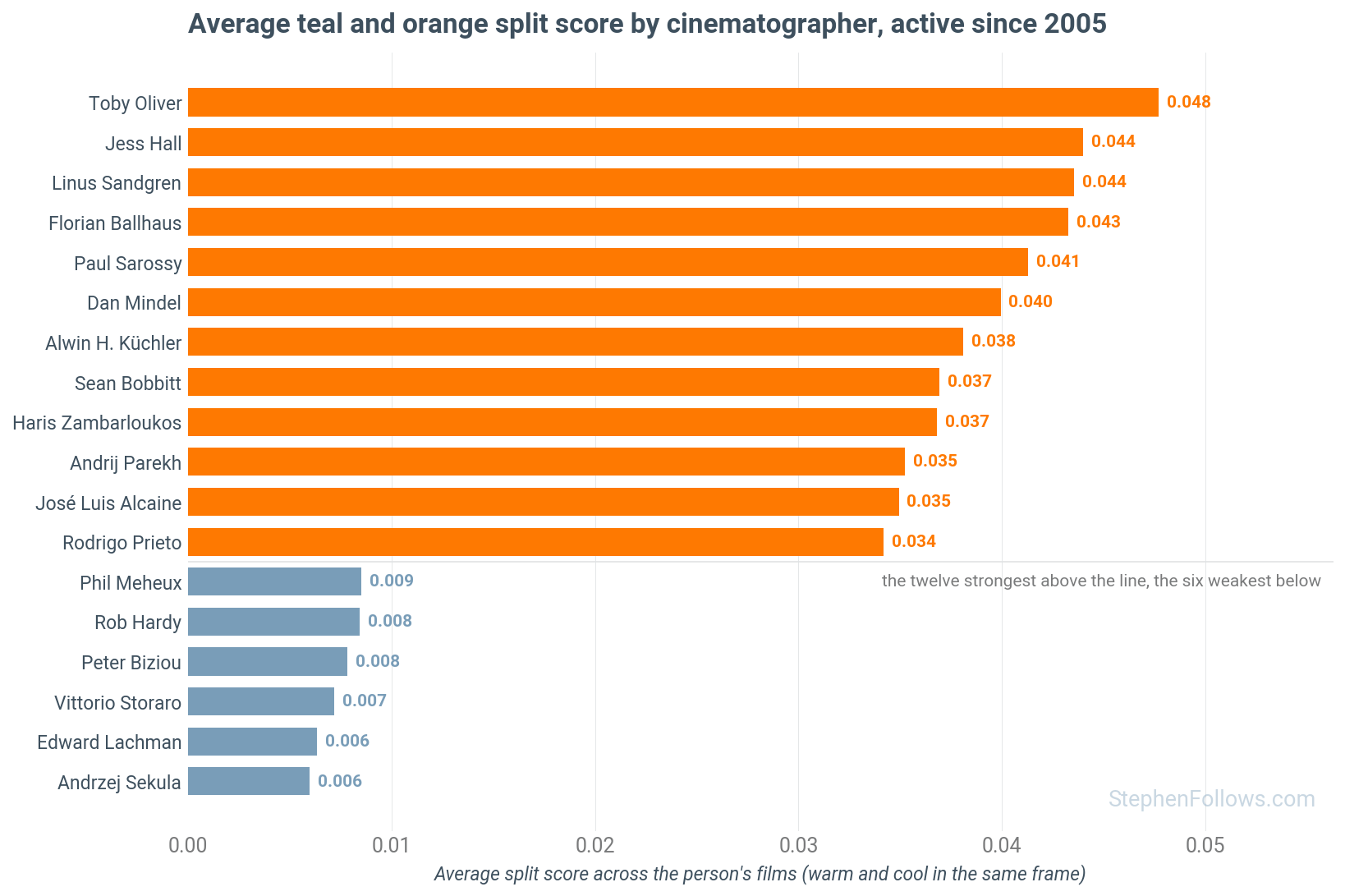
Among cinematographers, the strongest split belongs to Toby Oliver, Jess Hall, Linus Sandgren and Florian Ballhaus, with Dan Mindel, who shot the 2009 Star Trek, close behind. The most teal of all is Jonathan Sela, who shot John Wick and Transformers: The Last Knight.
Roger Deakins, with 40 films in the dataset, has one of the lowest split scores of anyone, and only 3% of his frames are teal. If you wanted a single name to stand for the resistance, it would be his.
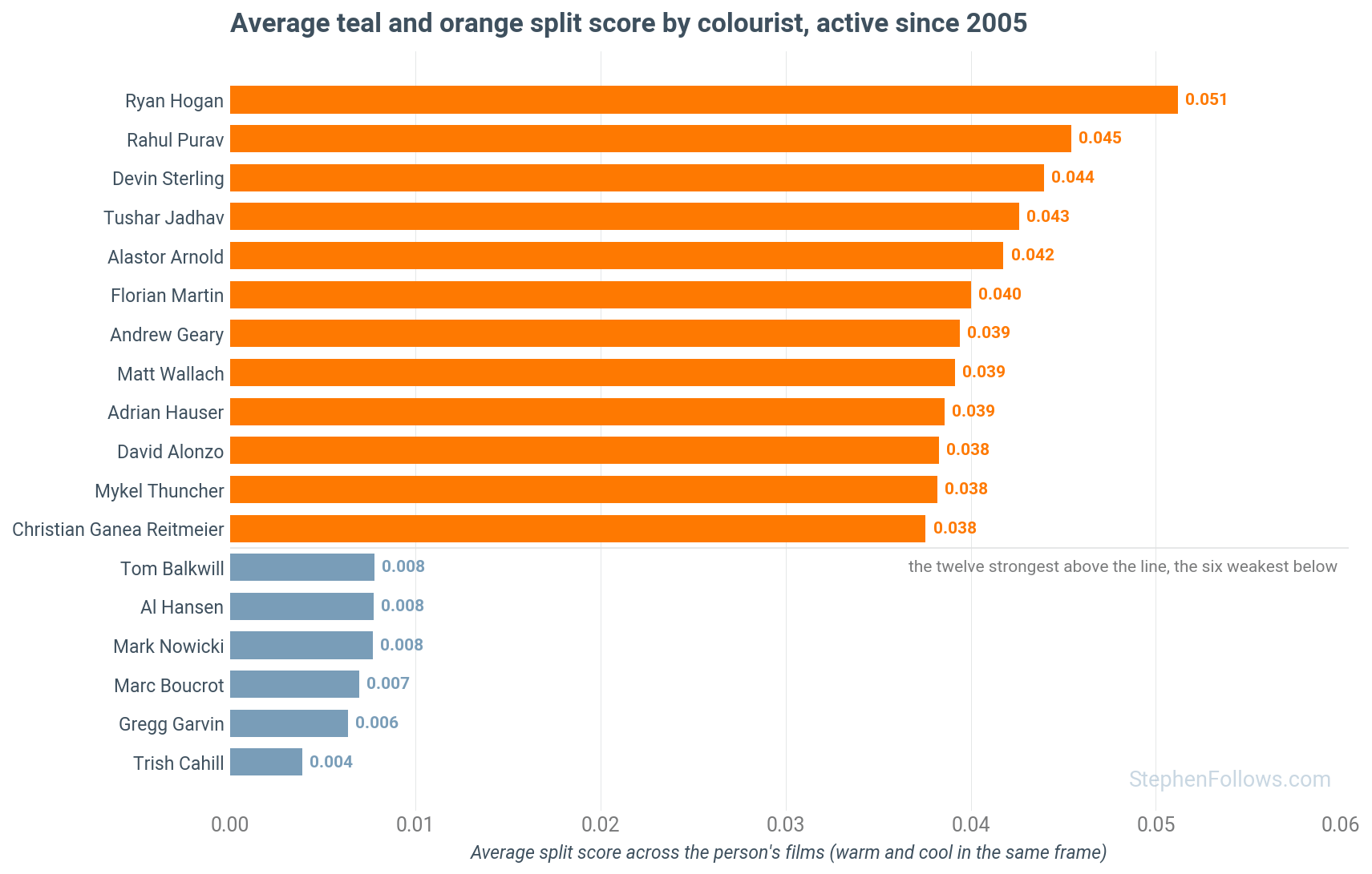
Then there are the people who actually turn the dials. IMDb’s credits list a colourist for about nine in ten films released since 2005, which gave me several hundred colourists to compare.
The most prolific of the digital era is Stefan Sonnenfeld of Company 3, who has 174 films in the dataset, including the Transformers series. His films run at 11% teal, with a split score above the average for their years.
Epilogue
So, is the teal-and-orange look over?
No.
It arrived with digital grading, dipped for five years when people started pointing it out online, and came back when we got bored of pointing it out. Three films in ten released last year carry it across their whole running time, more than at the height of the Transformers era. We just stopped caring.
Which brings me back to Terminator 2. I wasn't imagining it, but I wasn't watching 1991 either.
The anniversary release is StudioCanal’s 2017 restoration, regraded under James Cameron’s supervision for that year's 3D re-release.
I matched 2,256 shots between the theatrical version and the 2017 restoration, and discovered that the teal had been turned up to eleven. The hospital went from almost no teal to 30% of the frame, and the mall and the canal chase went from 4% to 39%.
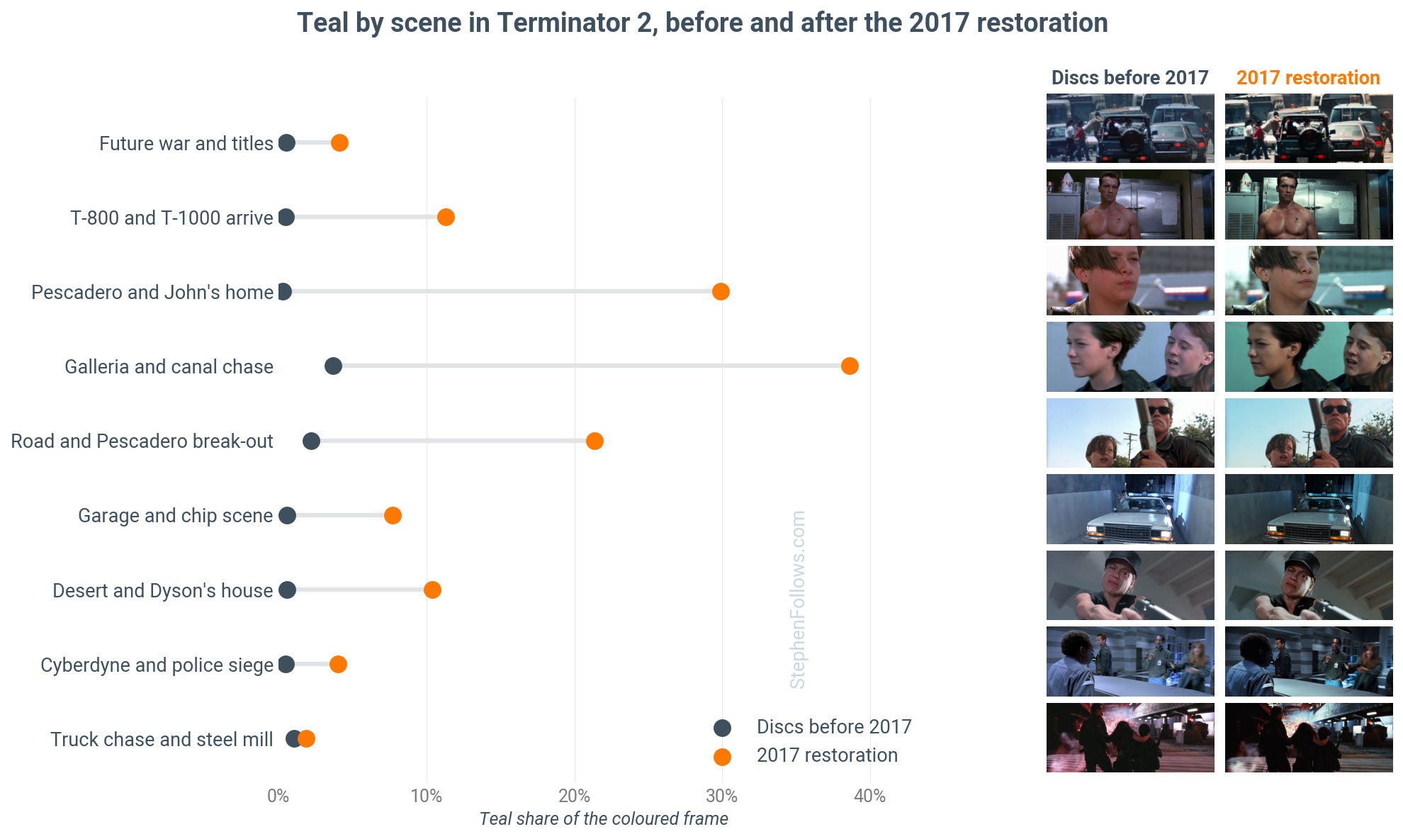
The version of Terminator 2 audiences saw in 1991 is 1% teal, below the average film of the 1990s. Whereas the version I saw a few weeks ago is 16% teal, nearly twice the average for films from the 2020s.
A film about travelling into the past to change the future has had its past changed from the future.
Notes
The corpus is my database of feature films with one keyframe extracted from every shot, 11.9 million shots in all. For this analysis, I kept films with colour data, removed animation, anime, and documentaries, required at least 20 usable shots, removed black-and-white films, and kept films released between 1930 and 2025. That leaves 8,135 films. Coverage runs from a few dozen films a year in the 1950s to 100 or more in every year since 1990 and 200 or more in most years since 2005. The 1930s and 1940s have too few colour films to chart, so they are not shown.
I have not measured every film ever made, and this is not a random sample. The database leans towards English-language films and towards films people have heard of. But with this many films the year-to-year figures are steady, and a difference of a point or two between neighbouring years is within the noise. The moves described in the article are many times larger than that.
For each frame, we keep pixels with chroma above 8 (that is, with real colour).
The orange share is the chroma-weighted proportion of those pixels within 30 degrees of hue 30 on the colour wheel, so it runs from red-orange to amber and includes skin, wood and tungsten light.
The teal share is the same for hue 195, blue-green.
The split score is orange share times teal share times four, so it is high only when both are present.
Shots are weighted by their screen time, derived from the gap to the next shot, and fades and black frames are excluded. A film ‘carries the look’ when its orange share and its teal share are both at least 10%. The threshold is just my guess at an appropriate level. Lowering it to 8% raises every decade’s share (35% of 2020s films vs 3% of 1990s films) without changing the curve's shape.
I detected faces with the InsightFace model on every keyframe, and determined shot scale with a four-class classifier. Face-free shots are those with no detection at 0.5 confidence or above. A film contributes to a subset only if it has at least 60 seconds of screen time.
One thing I checked was whether this is really a story about faces. Skin is orange, and modern films have more close-ups, so the orange half of the measure is partly faces.

My research last year showed that the way filmmakers frame human faces has changed. So I re-ran the teal share on shots with no faces, and on wide shots only, and the rise is the same across all shot types.
Production budgets come from The Numbers via OpusData for 3,268 films released from 2000, converted to 2024 dollars.
Colourists are any credit containing colourist, digital intermediate colourist or colour timer, excluding assistants, dailies colourists, producers and technicians. Directors and cinematographers needed at least eight colour films in the dataset to be ranked; colourists, at least six; and the charts show only people with at least one film from 2005 so the lab era is not ranked against the digital one. Every named figure is the plain average of that person’s films, and the era-adjusted comparisons in the text subtract the corpus average for each film’s year.
Some things this cannot see. It measures pixels, so it cannot tell a grade from a lighting choice or a set painted teal, though the face-free and wide-shot checks make a deliberate grade the only plausible explanation for the trend. Old films are measured from whatever transfer I have, and a restoration could in principle have been regraded, though the fact that pre-2000 films show almost no teal argues that they were not.
Others have measured the look before, mostly in trailers and posters. Edmund Helmer’s 2013 analysis of 312 trailers and Vijay Pandurangan’s study of poster colours both found orange and blue dominant, and a University of Waterloo team clustered the palettes of 29,000 trailers from 1960 to 2019 after removing skin tones. As far as I know, this is the first measurement across every shot of a large body of complete films, and the first to test whether the trend survives with faces removed.
Further reading
If you want to continue this colour journey into the world of movies, then you may enjoy my research last year into the colours of movie posters.

Love your roving curiosity. Never knew I needed a post like this.